
Flagship Dental
You know what they say: good things take time. This, we can attest to.
When our client, Dr. Jordan Turton from Flagship Dental, reached out with the exciting opportunity to design what would become his much larger, much more elevated dental practice, we jumped at the opportunity. Here was a client with big hopes and dreams for his practice, who didn’t see limitations in how it could evolve, or feel the need to follow the traditional dental-office playbook.
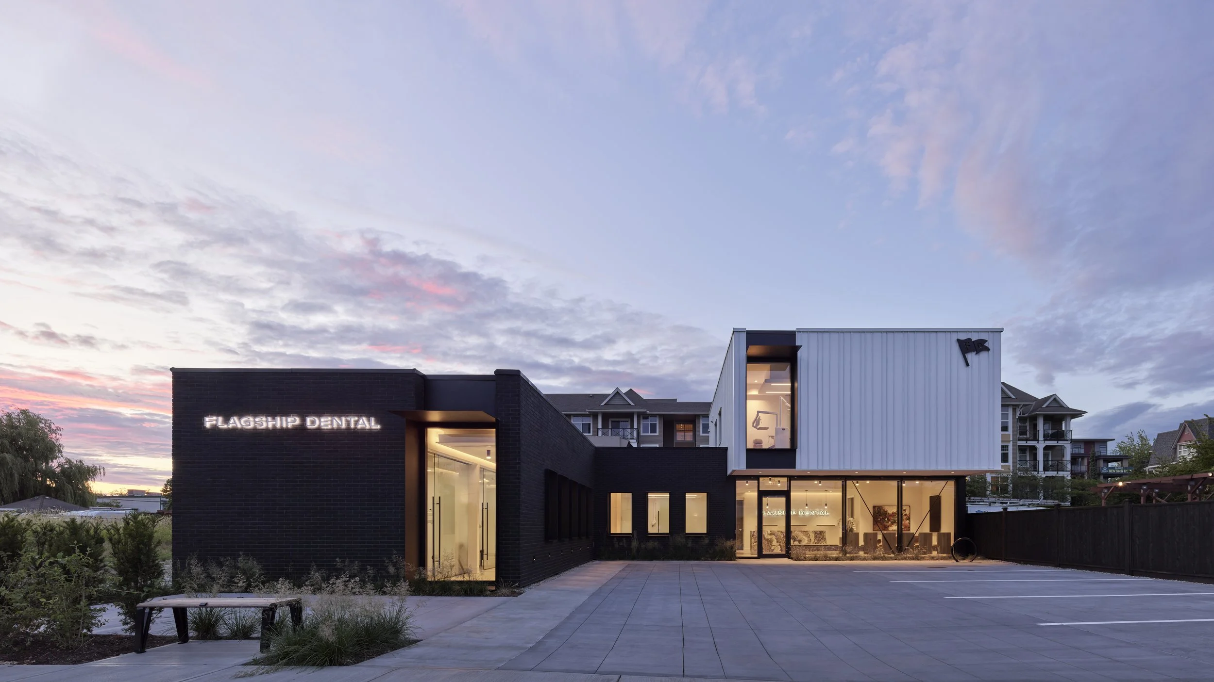
Set amongst what felt like outdated, small-town architecture, we quickly coined the project Cloverdale Modern. The name said a lot about what we hoped to create: something distinctly forward-looking that could signal where this community is headed next.
At our first design meeting, we were introduced to the team who would be the major players in bringing this project to life: the architectural team from Form Architects, Seasons Contracting as the general contractor, and our small but mighty design team (still just a duo at the time). We knew right away we were in great company.
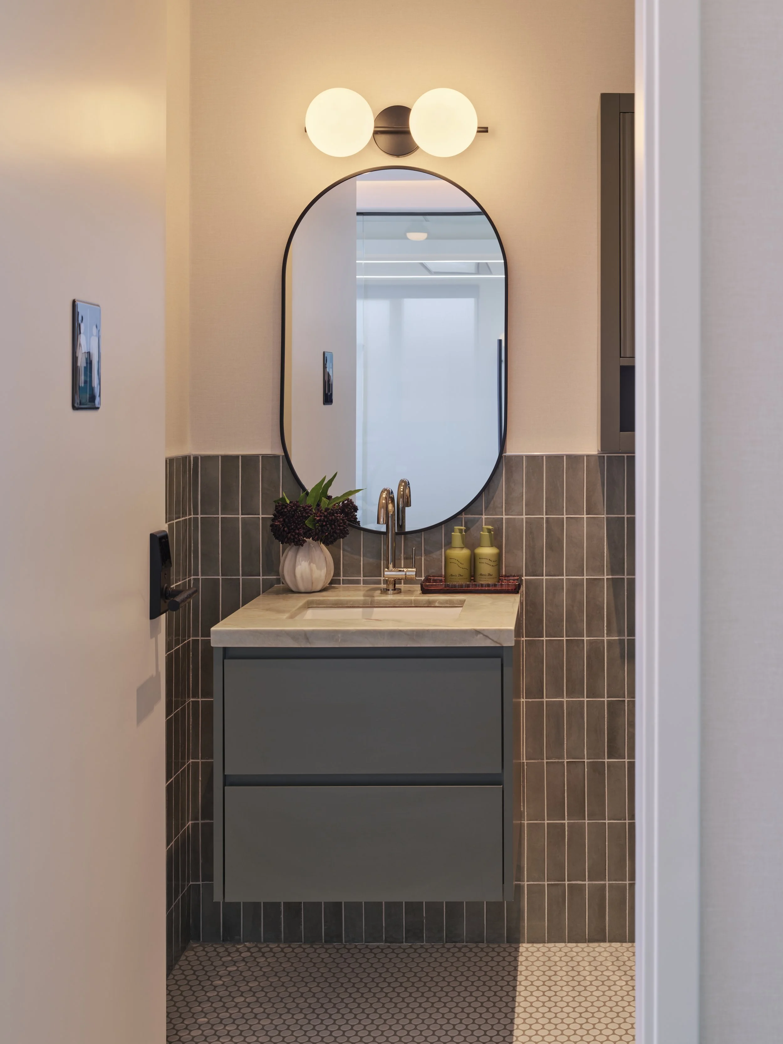
Early on in the design journey, we were told there wasn’t much point in trying to make the accessible washroom look beautiful. Between accessibility requirements, clearances, and code guidelines, there’s not a lot of wiggle room for fun. It’s a good thing we love a challenge! Instead of settling for a stark, spec-grade space, we clad all four walls in floor-to-ceiling tile and added a handmade tonal concrete sink, an arch that mimics the same shape seen in the waiting room, remnant natural stone (we’ll always always choose natural over manufactured), an automated brass faucet, and softly glowing alabaster globes that feel like something you’d find in a funky restaurant rather than a dental office. Safe to say, this was a hill we were willing to die on. And we’re so glad we did!
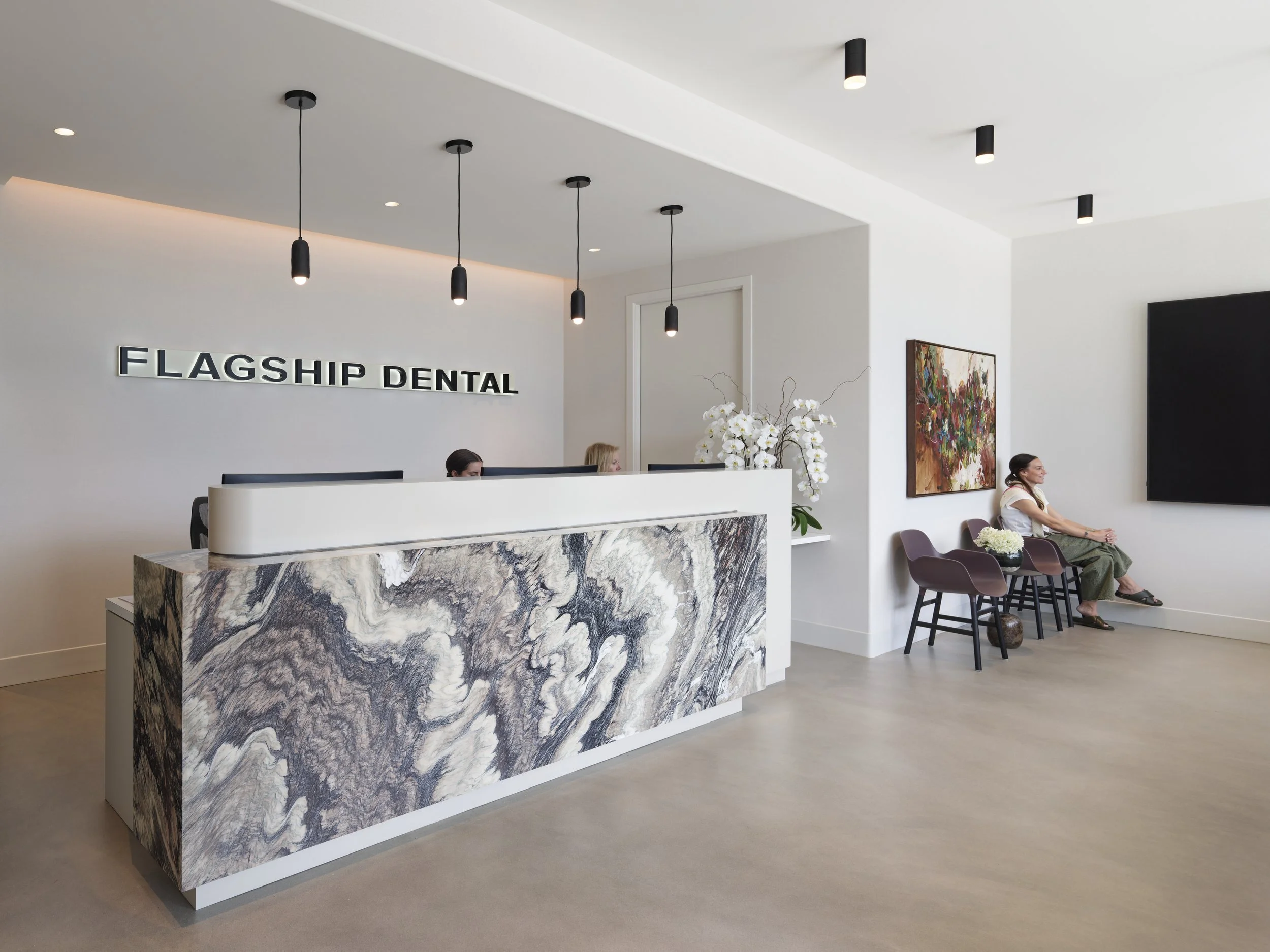
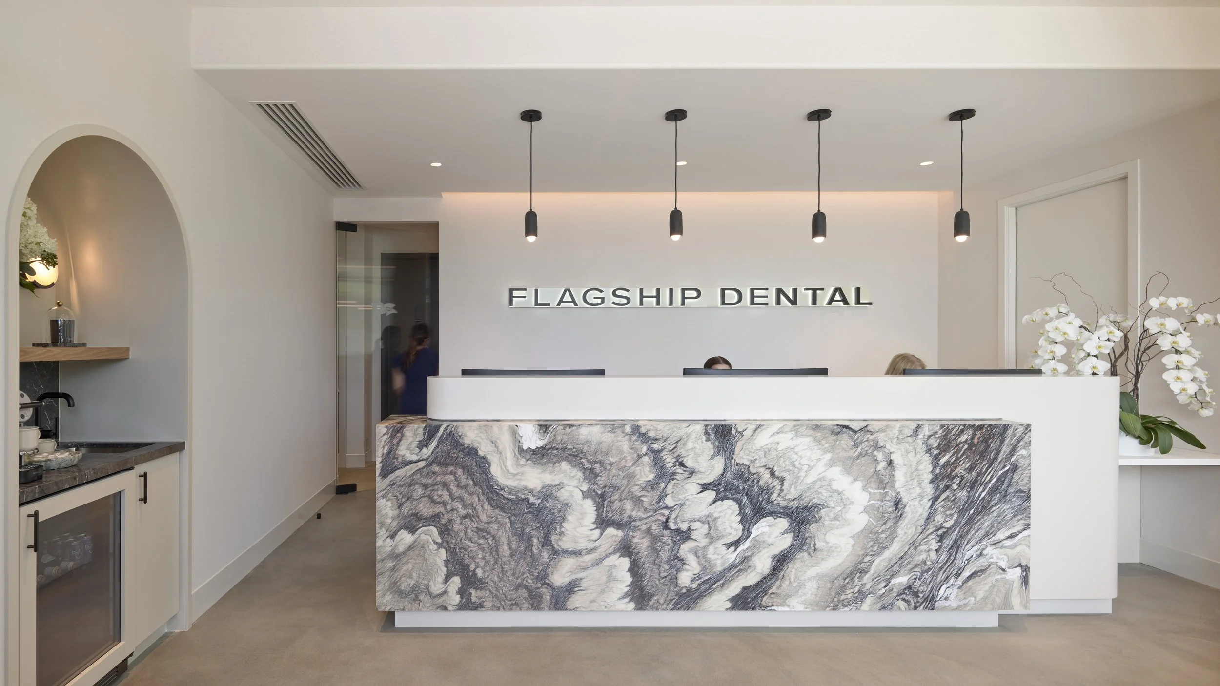
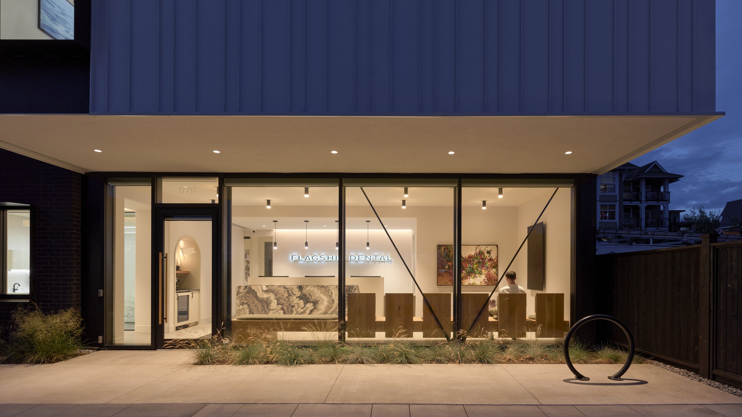
When specifying furnishings in residential projects, we often begin with the rug, as they typically have the largest footprint in a room and give us an anchor for everything that follows. For this project, our jumping-off point happened at Bordignon Stone, where we first saw the slabs of Cipollino stone. It was one of those design moments when you just know you’ve found “the one.” From there, natural materials, beautiful craftsmanship, and details that felt more hospitality-driven than traditionally clinical became the thread running throughout.
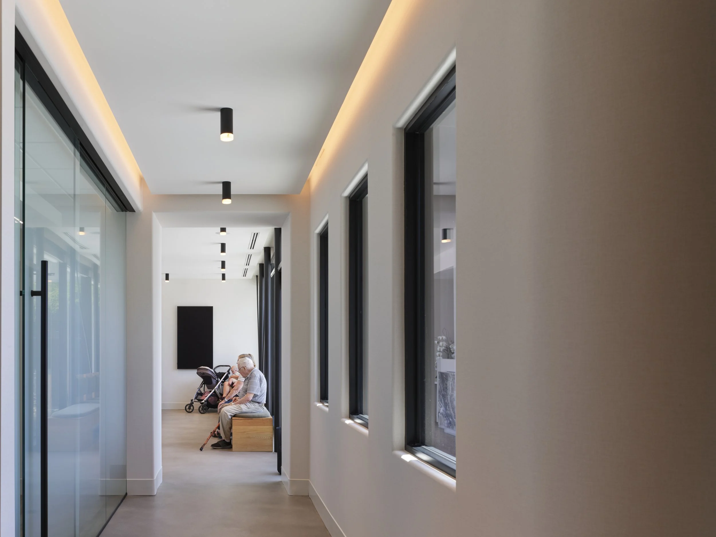
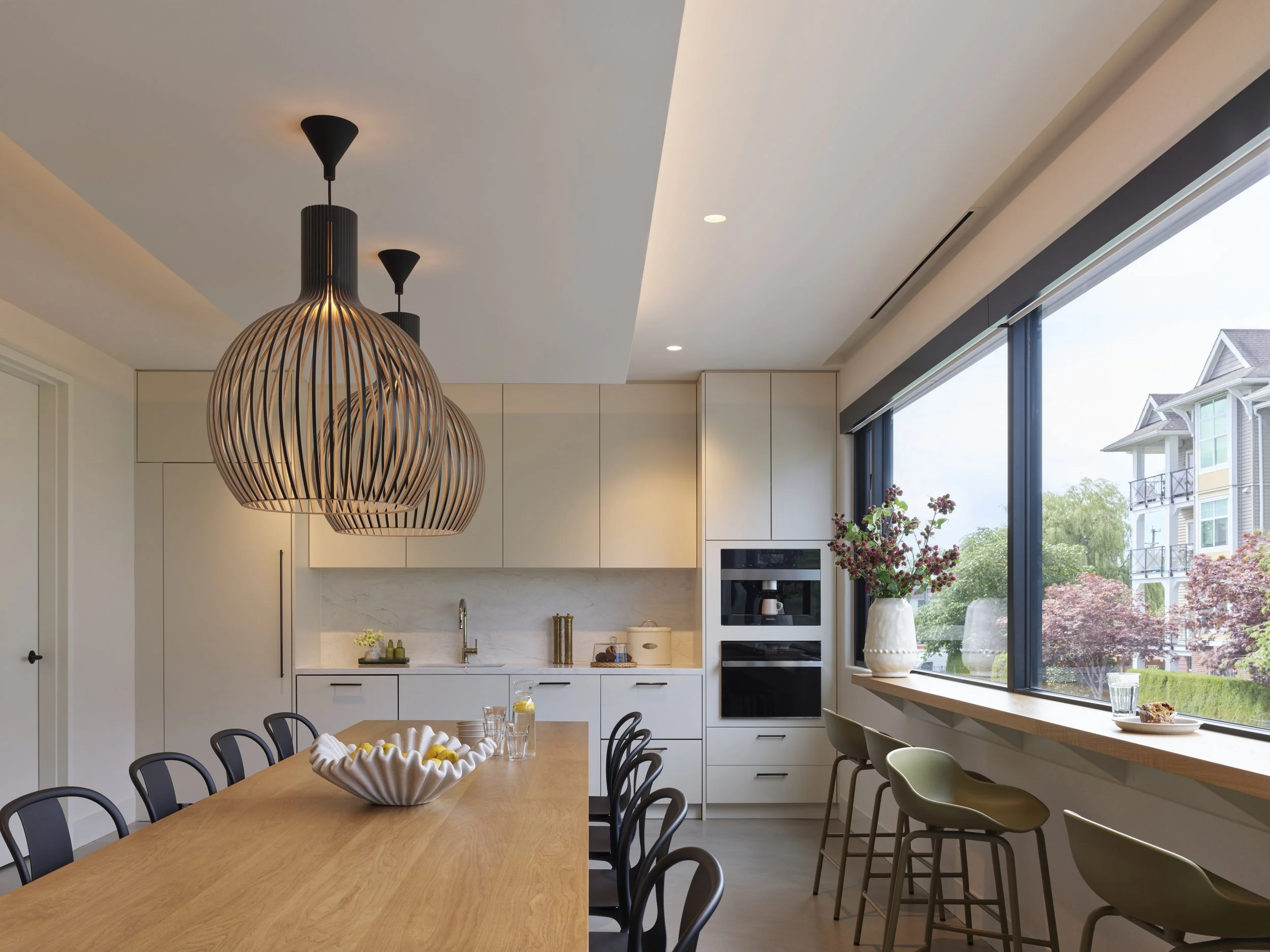
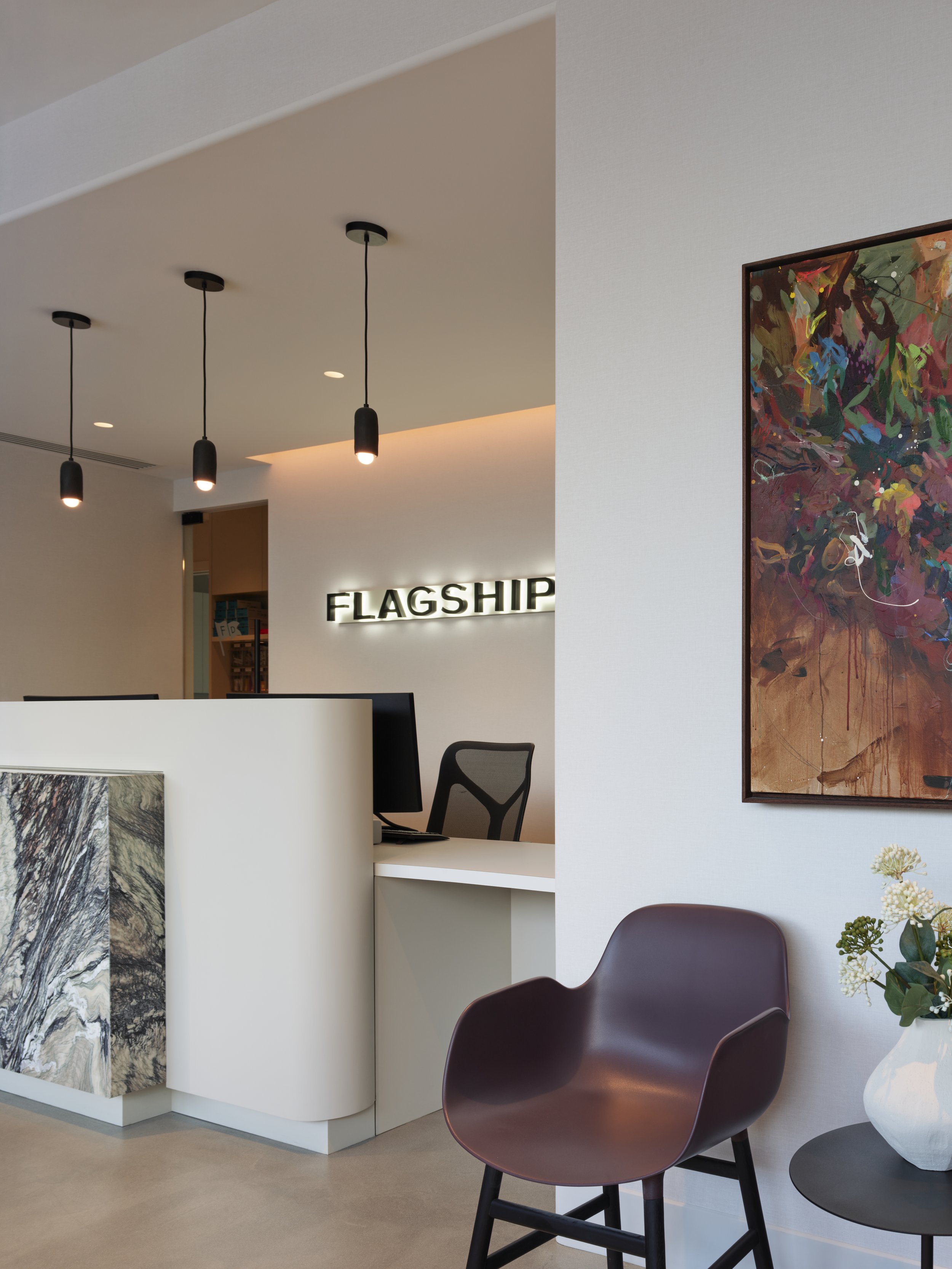
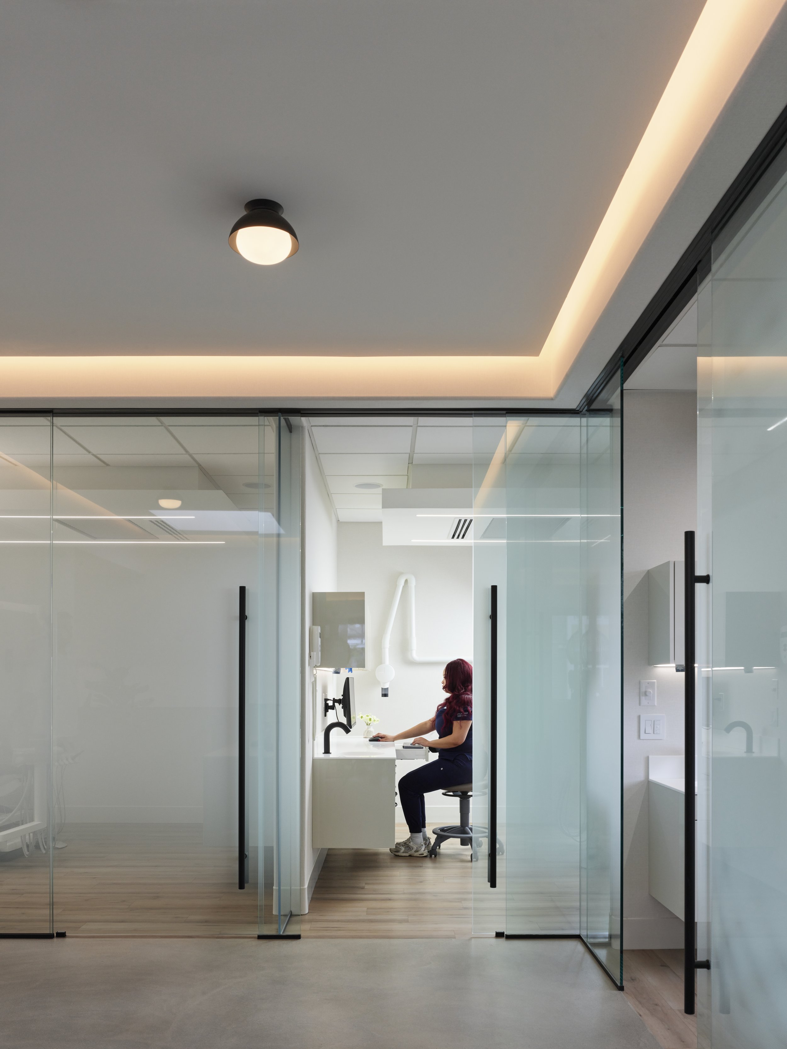
Lighting was a huge part of that equation. In healthcare environments, atmosphere can easily be sacrificed in favour of function, and we weren’t interested in bending on aesthetic. Prior to the expansion and remodel, the reception team had a knee-jerk reaction when we suggested pendant lighting spanning the length of the reception desk. Their previous fixtures created heat and glare that they simply kept them turned off (what a shame!). Working alongside our go-to partners in premium lighting, Visual Comfort, we developed a lighting package around how each part of the practice needed to function. Their architectural lighting expertise helped guide lumen output and fixture spacing, increasing output in the operatories, where task lighting is critical, and softening it throughout the common spaces to create a greater sense of calm. For some, going to the dentist is already nerve-racking enough; the last thing we wanted was for harsh lighting to contribute to it.
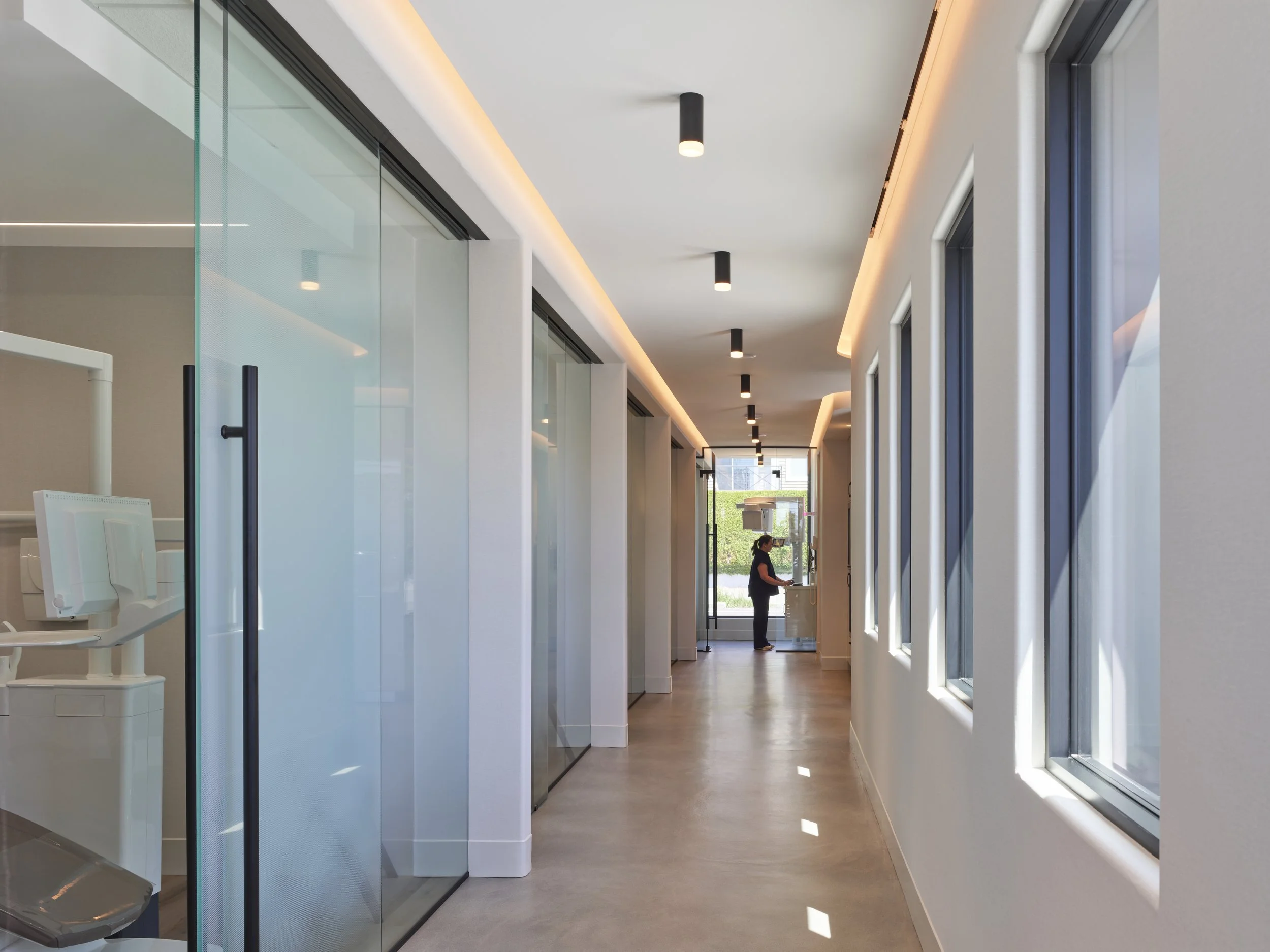
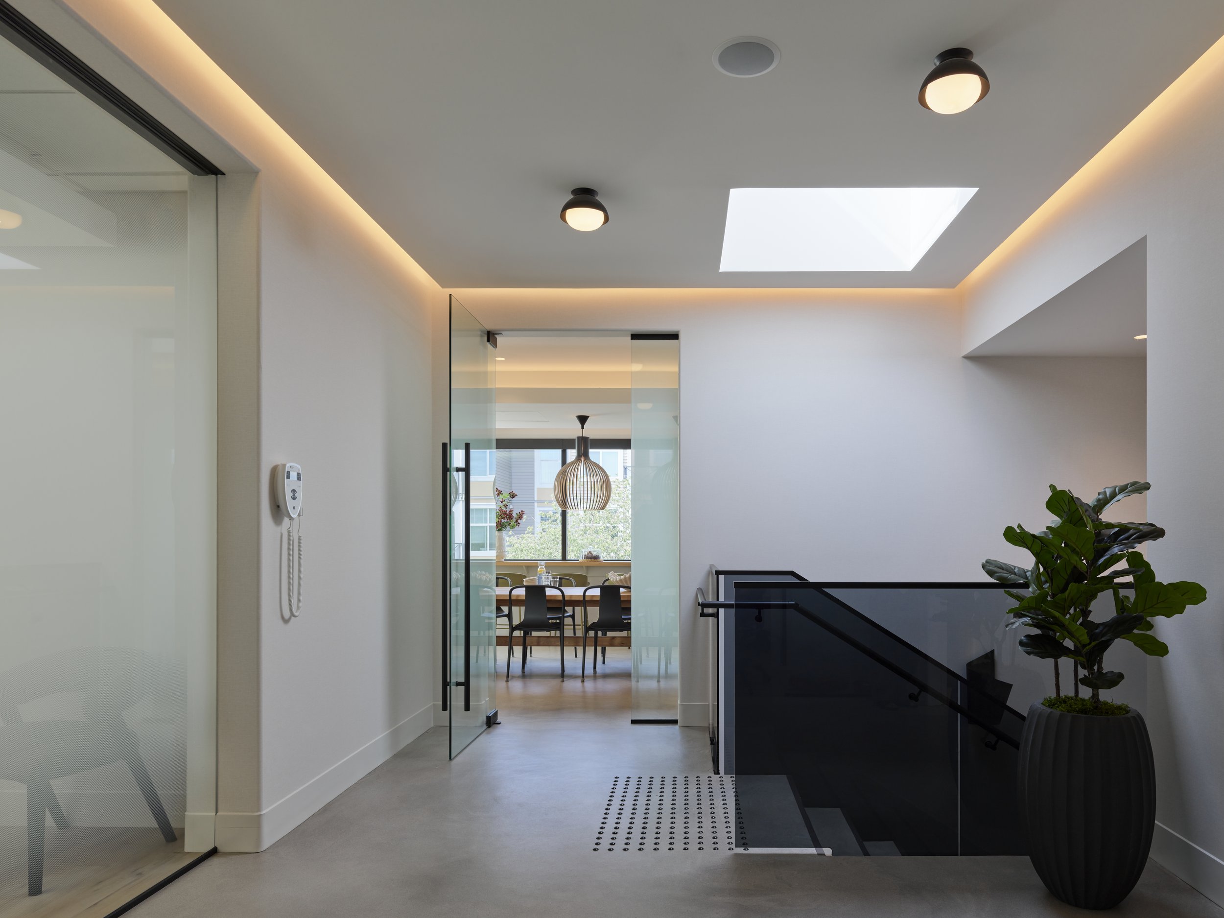
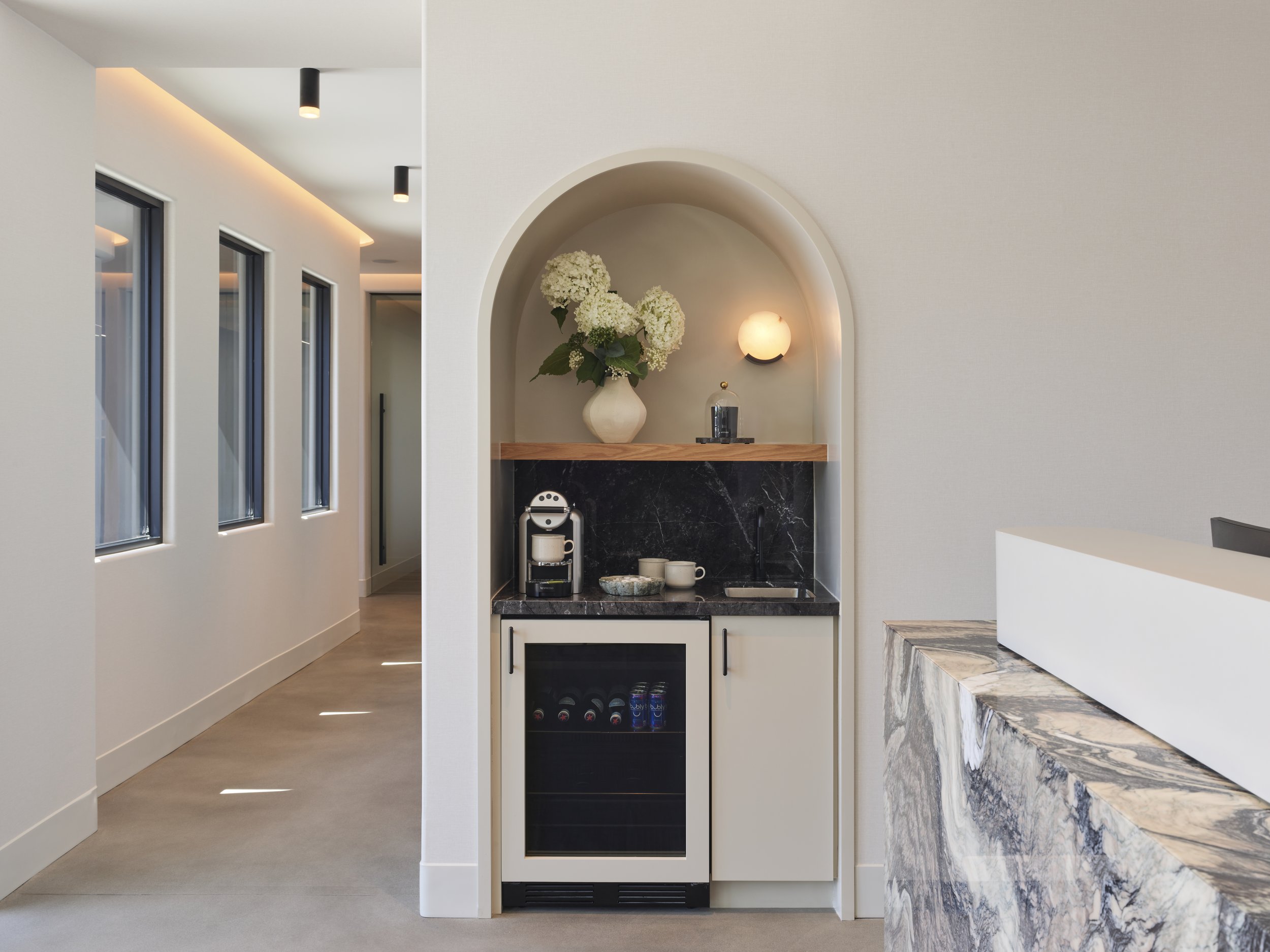
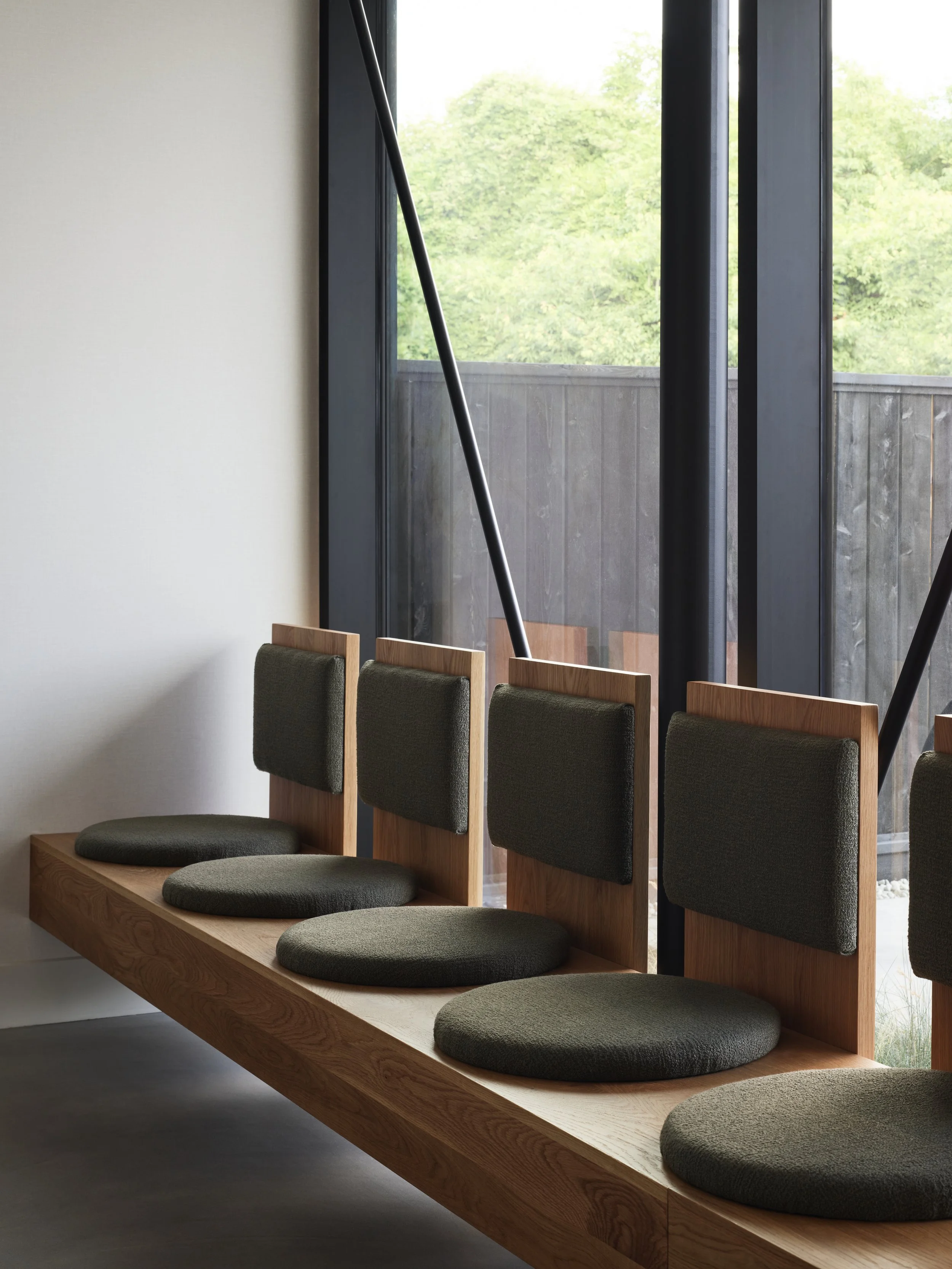
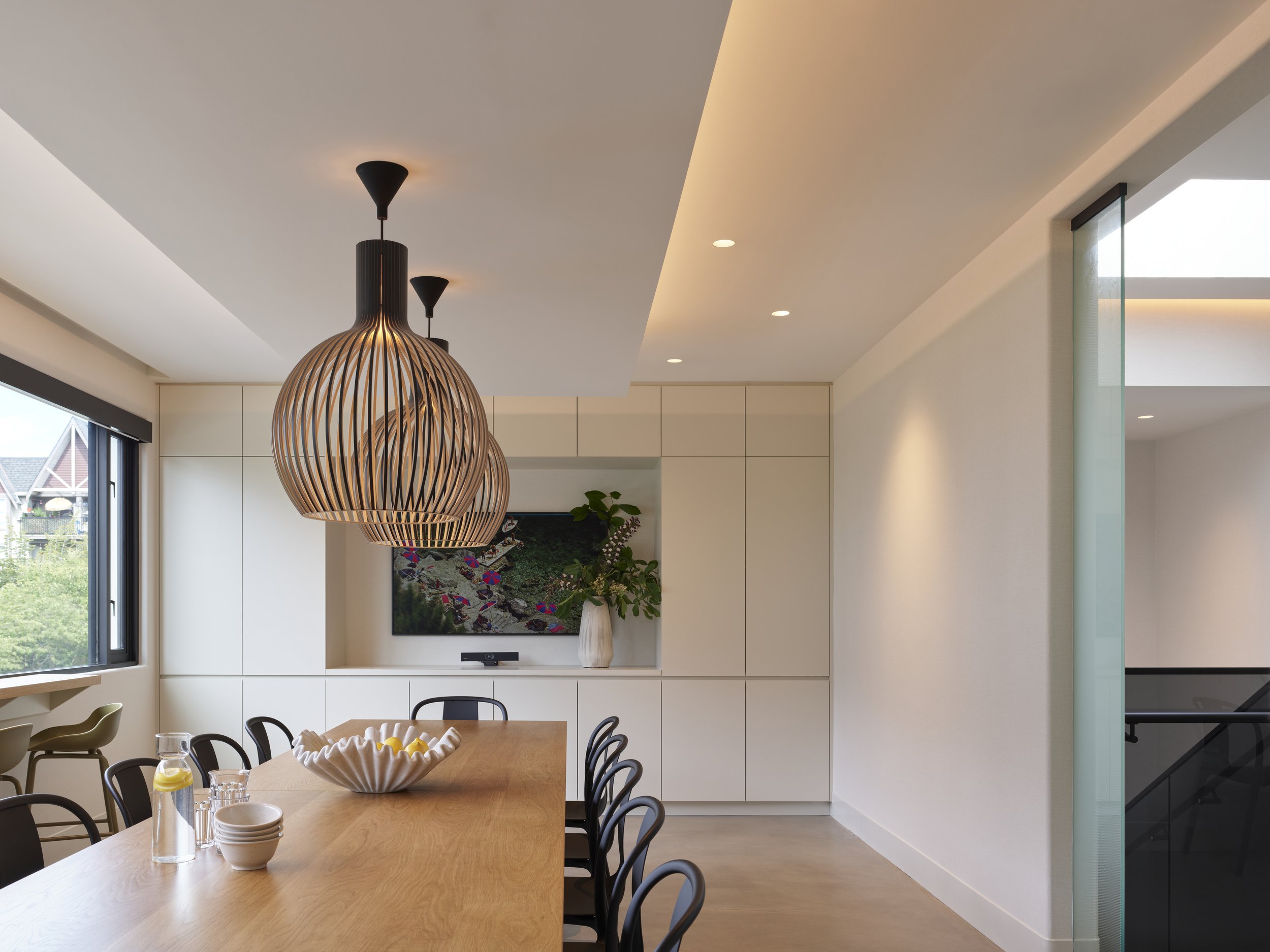
That same thinking carried into the natural materials and architectural details throughout the practice. Custom 3-inch alabaster extensions transform what would otherwise have been solid bronze cylinder flush mounts, handmade pendants in the staff lobby allow natural light to filter through, and indirect cove lighting casts a gentle glow from above. Curves repeat throughout, from rounded walls and windows to the arch at the coffee station, the curved end of the reception desk, and a suspended cloud-like architectural feature housing the TV over the operatory patient chairs. A handcrafted waiting-room bench, made locally from 100% natural oak by the joinery geniuses at Lock & Mortice, brings another layer of warmth and craftsmanship. Individually, they’re subtle details; together, they help calm the nervous system and make a clinical environment feel anything but. For the staff who spend their days here and the patients who walk through these doors, they’re also little nudges of appreciation—a reminder that when you invest in your people, they invest in your business.
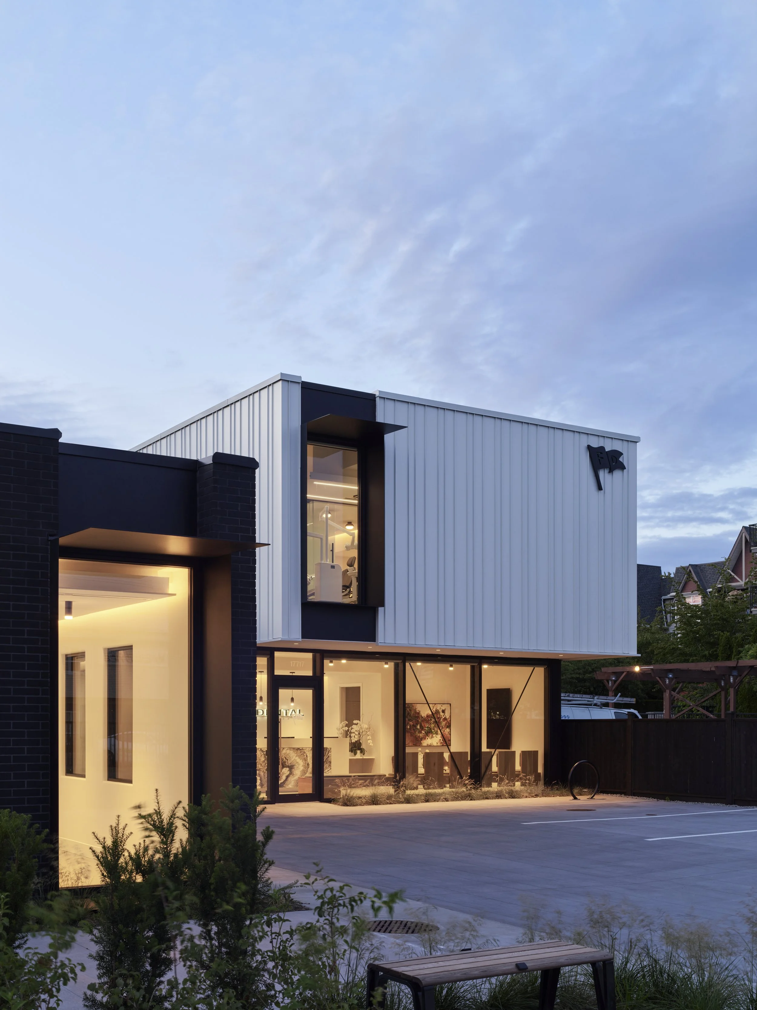
We can’t talk about the architecture without talking about the exterior. There’s something we love about the juxtaposition of this modern structure against its more traditional surroundings. Cloverdale is evolving and growing, and creating a dental practice that feels ready to carry its patients into that next chapter felt particularly fitting. There’s a lot of potential and opportunity ahead; we just happen to be a little ahead of the game.
Ultimately, Flagship Dental was designed around how people should feel when they walk through its doors: calm, comfortable, cared for, and completely at ease. Behind that feeling are countless decisions around architecture, lighting, materiality, accessibility, craftsmanship, and function—all thoughtfully considered so that, in the end, the space simply feels good.
Built on partnership, collaboration, smart design, an ambitious client, and nearly two years of work behind the scenes, Flagship Dental is a pretty great reminder that good things really do take time. This one was worth the wait.
Photography: Andrew Latreille Photography